declare styleableandroid自定义控件怎么用
declare styleable 时间:2022-02-27 阅读:()
android cardview 怎么用
CardView是安卓5.0的新控件,这控件其实就是一个卡片,当然我们自己也完全可以定义这样一个卡片,从现在的App中可以看到各式各样的自定义卡片,所以这个控件意义不是很大。support中的view所以使用在布局里面的时候一下子看不到效果的,比较不好。CardView继承的是FrameLayout,所以摆放内部控件的时候需要注意一下。 用代码来进行参数说明: <resources> <declare-styleable name="CardView"> <!-- Background color for CardView. --> <!-- 背景色 --> <attr name="cardBackgroundColor" format="color" /> <!-- Corner radius for CardView. --> <!-- 边缘弧度数 --> <attr name="cardCornerRadius" format="dimension" /> <!-- Elevation for CardView. --> <!-- 高度 --> <attr name="cardElevation" format="dimension" /> <!-- Maximum Elevation for CardView. --> <!-- 最大高度 --> <attr name="cardMaxElevation" format="dimension" /> <!-- Add padding in API v21+ as well to have the same measurements with previous versions. --> <!-- 设置内边距,v21+的版本和之前的版本仍旧具有一样的计算方式 --> <attr name="cardUseCompatPadding" format="boolean" /> <!-- Add padding to CardView on v20 and before to prevent intersections between the Card content and rounded corners. --> <!-- 在v20和之前的版本中添加内边距,这个属性是为了防止卡片内容和边角的重叠 --> <attr name="cardPreventCornerOverlap" format="boolean" /> <!-- 下面是卡片边界距离内部的距离--> <!-- Inner padding between the edges of the Card and children of the CardView. --> <attr name="contentPadding" format="dimension" /> <!-- Inner padding between the left edge of the Card and children of the CardView. --> <attr name="contentPaddingLeft" format="dimension" /> <!-- Inner padding between the right edge of the Card and children of the CardView. --> <attr name="contentPaddingRight" format="dimension" /> <!-- Inner padding between edge of the Card and children of the CardView. --> <attr name="contentPaddingTop" format="dimension" /> <!-- Inner padding between the bottom edge of the Card and children of the CardView. --> <attr name="contentPaddingBottom" format="dimension" /> </declare-styleable> </resources> 看完了参数,那么我们来看看布局文件中的用法。 <!-- A CardView that contains a TextView --> <android.support.v7.widget.CardView xmlns:android="/apk/res/android" xmlns:tools="/tools" xmlns:app="/apk/res-auto" android:id="@+id/card_view" android:layout_width="200dp" android:layout_height="200dp" android:layout_gravity="center" app:cardCornerRadius="4dp" app:cardBackgroundColor="#ff0000" app:cardElevation="5dp" app:cardMaxElevation="10dp" app:cardUseCompatPadding="true" app:cardPreventCornerOverlap="true"> <TextView android:id="@+id/info_text" android:layout_width="match_parent" android:layout_height="match_parent" android:layout_gravity="center" android:textSize="25sp" android:textColor="#ffffff" android:text="Hello CardView"/> </android.support.v7.widget.CardView> 以上就是详细使用说明。 这样我们就定义好了一个CardView了。android自定义控件怎么用
一、控件自定义属性介绍 以下示例中代码均在values/attrs.xml 中定义,属性均可随意命名。 1. reference:参考某一资源ID。 示例: <declare-styleable name = "名称"> <attr name = "background" format = "reference" /> <attr name = "src" format = "reference" /> </declare-styleable> 2. color:颜色值。 示例: <declare-styleable name = "名称"> <attr name = "textColor" format = "color" /> </declare-styleable> 3. boolean:布尔值。 示例: <declare-styleable name = "名称"> <attr name = "focusable" format = "boolean" /> </declare-styleable> 4. dimension:尺寸值。 示例: <declare-styleable name = "名称"> <attr name = "layout_width" format = "dimension" /> </declare-styleable> 5. float:浮点值。 示例: <declare-styleable name = "名称"> <attr name = "fromAlpha" format = "float" /> <attr name = "toAlpha" format = "float" /> </declare-styleable> 6. integer:整型值。 示例: <declare-styleable name = "名称"> <attr name = "frameDuration" format="integer" /> <attr name = "framesCount" format="integer" /> </declare-styleable> 7. string:字符串。 示例: <declare-styleable name = "名称"> <attr name = "text" format = "string" /> </declare-styleable> 8. fraction:百分数。 示例: <declare-styleable name="名称"> <attr name = "pivotX" format = "fraction" /> <attr name = "pivotY" format = "fraction" /> </declare-styleable> 9. enum:枚举值。 示例: <declare-styleable name="名称"> <attr name="orientation"> <enum name="horizontal" value="0" /> <enum name="vertical" value="1" /> </attr> </declare-styleable> 10. flag:位或运算。 示例: <declare-styleable name="名称"> <attr name="windowSoftInputMode"> <flag name = "stateUnspecified" value = "0" /> <flag name = "stateUnchanged" value = "1" /> <flag name = "stateHidden" value = "2" /> <flag name = "stateAlwaysHidden" value = "3" /> </attr> </declare-styleable> 11.多类型。 示例: <declare-styleable name = "名称"> <attr name = "background" format = "reference|color" /> </declare-styleable> 二、属性的使用以及自定义控件的实现 1、构思控件的组成元素,思考所需自定义的属性。 比如:我要做一个 <带阴影的按钮,按钮正下方有文字说明>(类似9宫格按钮) 新建values/attrs.xml <?xml version="1.0" encoding="utf-8"?> <resources> <declare-styleable name="custom_view"> <attr name="custom_id" format="integer" /> <attr name="src" format="reference" /> <attr name="background" format="reference" /> <attr name="text" format="string" /> <attr name="textColor" format="color" /> <attr name="textSize" format="dimension" /> </declare-styleable> </resources> 以上,所定义为custom_view,custom_id为按钮id,src为按钮,background为阴影背景,text为按钮说明,textColor为字体颜色,textSize为字体大小。 2、怎么自定义控件呢,怎么使用这些属性呢?话不多说请看代码,CustomView : .nanlus.custom; .nanlus.custom.R; import android.content.Context; import android.content.res.TypedArray; import android.graphics.Color; import android.graphics.drawable.Drawable; import android.util.AttributeSet; import android.view.Gravity; import android.view.View; import android.view.View.OnClickListener; import android.widget.FrameLayout; import android.widget.ImageButton; import android.widget.ImageView; import android.widget.TextView; public class CustomView extends FrameLayout implements OnClickListener { private CustomListener customListener = null; private Drawable mSrc = null, mBackground = null; private String mText = ""; private int mTextColor = 0; private float mTextSize = 20; private int mCustomId = 0; private ImageView mBackgroundView = null; private ImageButton mButtonView = null; private TextView mTextView = null; private LayoutParams mParams = null; public CustomView(Context context) { super(context); } public CustomView(Context context, AttributeSet attrs) { super(context, attrs); TypedArray a = context.obtainStyledAttributes(attrs, R.styleable.custom_view); mSrc = a.getDrawable(R.styleable.custom_view_src); mBackground = a.getDrawable(R.styleable.custom_view_background); mText = a.getString(R.styleable.custom_view_text); mTextColor = a.getColor(R.styleable.custom_view_textColor, Color.WHITE); mTextSize = a.getDimension(R.styleable.custom_view_textSize, 20); mCustomId = a.getInt(R.styleable.custom_view_custom_id, 0); mTextView = new TextView(context); mTextView.setTextSize(mTextSize); mTextView.setTextColor(mTextColor); mTextView.setText(mText); mTextView.setGravity(Gravity.CENTER); mTextView.setLayoutParams(new LayoutParams(LayoutParams.WRAP_CONTENT, LayoutParams.WRAP_CONTENT)); mButtonView = new ImageButton(context); mButtonView.setImageDrawable(mSrc); mButtonView.setBackgroundDrawable(null); mButtonView.setLayoutParams(new LayoutParams(LayoutParams.WRAP_CONTENT, LayoutParams.WRAP_CONTENT)); mButtonView.setOnClickListener(this); mBackgroundView = new ImageView(context); mBackgroundView.setImageDrawable(mBackground); mBackgroundView.setLayoutParams(new LayoutParams( LayoutParams.WRAP_CONTENT, LayoutParams.WRAP_CONTENT)); addView(mBackgroundView); addView(mButtonView); addView(mTextView); this.setOnClickListener(this); a.recycle(); } @Override protected void onAttachedToWindow() { super.onAttachedToWindow(); mParams = (LayoutParams) mButtonView.getLayoutParams(); if (mParams != null) { mParams.gravity = Gravity.CENTER_HORIZONTAL | Gravity.TOP; mButtonView.setLayoutParams(mParams); } mParams = (LayoutParams) mBackgroundView.getLayoutParams(); if (mParams != null) { mParams.gravity = Gravity.CENTER_HORIZONTAL | Gravity.TOP; mBackgroundView.setLayoutParams(mParams); } mParams = (LayoutParams) mTextView.getLayoutParams(); if (mParams != null) { mParams.gravity = Gravity.CENTER_HORIZONTAL | Gravity.BOTTOM; mTextView.setLayoutParams(mParams); } } public void setCustomListener(CustomListener l) { customListener = l; } @Override public void onClick(View v) { if (customListener != null) { Click(v, mCustomId); } } public interface CustomListener { void Click(View v, int custom_id); } } 代码很简单,就不多说,下面来看看我们的CustomView是怎么用的,请看: 3、自定义控件的使用 话不多说,请看代码,main.xml: <?xml version="1.0" encoding="utf-8"?> <RelativeLayout xmlns:android="/apk/res/android" xmlns:nanlus="/apk/.nanlus.custom" android:layout_width="fill_parent" android:layout_height="fill_parent" > <LinearLayout android:layout_width="wrap_content" android:layout_height="wrap_content" android:layout_centerHorizontal="true" android:layout_centerVertical="true" android:orientation="horizontal" > &.nanlus.custom.CustomView android:id="@+id/custom1" android:layout_width="wrap_content" android:layout_height="wrap_content" android:layout_weight="1" nanlus:background="@drawable/background" nanlus:custom_id="1" nanlus:src="@drawable/style_button" nanlus:text="按钮1" > <.nanlus.custom.CustomView> </LinearLayout> </RelativeLayout> 在这里需要解释一下, xmlns:nanlus="/apk/.nanlus.custom" nanlus为在xml中的前缀.nanlus.custom为包名 4、在Activity中,直接上代码 .nanlus.custom; import android.os.Bundle; import android.view.View; import android.widget.ImageButton; import android.widget.ImageView; import android.widget.TextView; import android.widget.Toast; .nanlus.BaseActivity; .nanlus.custom.R; .nanlus.custom.CustomView.CustomListener; public class CustomActivity extends BaseActivity implements CustomListener { @Override protected void onCreate(Bundle savedInstanceState) { super.onCreate(savedInstanceState); setContentView(R.layout.main); ((CustomView) this.findViewById(R.id.custom1)).setCustomListener(this); } @Override public void Click(View v, int custom_id) { switch (custom_id) { case 1: Toast.makeText(this, "hello !!!", Toast.LENGTH_LONG).show(); break; default: break; } } }
- declare styleableandroid自定义控件怎么用相关文档
- declare styleableandroid swiperefreshlayout 为什么是圆形的
- declare styleable从源码中浅析Android中怎么利用attrs和styles定义控件
- declare styleableandroid自定义控件,一般遵循什么样的原则
- declare styleablew5500 socket0怎么接受数据
- declare styleableandroid中 app:activecolor="#ff9000"作用?
- declare styleable如何android代码控制图片转换
totyun:香港cn2 vps,5折优惠,$6/月,10Mbps带宽,不限流量,2G内存/2核/20g+50g
totyun,新公司,主要运作香港vps、日本vps业务,接入cn2网络,不限制流量!VPS基于KVM虚拟,采用系统盘和数据盘分离,从4G内存开始支持Windows系统...大家注意下,网络分“Premium China”、“Global”,由于站长尚未测试,所以也还不清楚情况,有喜欢吃螃蟹的尝试过不妨告诉下站长。官方网站:https://totyun.com一次性5折优惠码:X4QTYVNB3P...

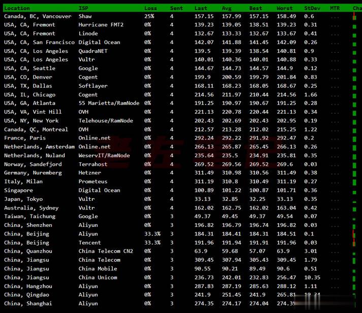
Vultr VPS韩国首尔机房速度和综合性能参数测试
Vultr 商家有新增韩国首尔机房,这个是继日本、新加坡之后的第三个亚洲机房。不过可以大概率知道肯定不是直连中国机房的,因为早期的日本机房有过直连后来取消的。今天准备体验看看VULTR VPS主机商的韩国首尔机房的云服务器的速度和性能。1、全球节点PING速度测试这里先通过PING测试工具看看全球几十个节点的PING速度。看到好像移动速度还不错。2、路由去程测试测试看看VULTR韩国首尔机房的节点...
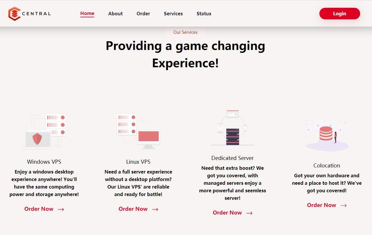
Central美国65折优惠,美国达拉斯机房VPS季付赠送双倍内存
Central美国独立日活动正在进行中,旗下美国达拉斯机房VPS 65折优惠,季付赠送双倍内存(需要发工单),Central租用的Hivelocity的机房,只支持信用卡和加密货币付款,不支持paypal,需要美国独服的可以谨慎入手试试。Central怎么样?Central便宜服务器,Central自称成立于2019年,主营美国达拉斯机房Linux vps、Windows vps、专用服务器和托管...
declare styleable为你推荐
-
php开发工具php开发用什么软件sap是什么SAP是用来做什么的?blastpblast 和bomb的区别provisionedwindows server 2012 R2系统中,哪种方法可以增加thin provisioned磁盘大小?豆瓣fm电台虾米猜电台和豆瓣fm哪个好?高质量图片ps 合成图片,怎样才算高质量的?从那些方面判定照片的质量实数的定义数学中的“实数”是什么?色温图色温是什么意思?色温图表蓝牙开发Android蓝牙开发代码怎么写?碰撞球碰撞分为哪几种,分别解释一下