字体写电子邮件时尽量避免使用的五大字体(论文范文)
实用范文
《写电子邮件时尽量避免使用的五大字体》
Word格式可编辑可修改
精心整理放心阅读欢迎下载
文档信息
写电子邮件时尽量避免使用的五大字体
写电子邮件时尽量避免使用的五大字体pice in all shapes and sizes and colou. But that doesn'tmean you're allowed to go mad and use just ANY font though:these ones are banned。
字体形状千差万别大小不一颜色各异。但这不意味着你可以随心所欲选择使用任何字体 以下几种字体就不建议使用。
Step 1: Arial
Arial' s been around so long now that it' s comfortingand familiar in the same way that makes middle-aged men tradein their wives for a younger sexier model. Arial istherefore the pixel equivalent of a frumpy disappointinghousewife
Arial已经陪伴我们太久了。如今在使用这个字体时人们常会顺理成章地联想到这个场景一名中年男子抛弃了他的妻子换了位更年轻更性感的模特作伴。因此 Arial作为一种字体与衣着邋遢的、心灰意冷的弃妇有异曲同工之妙。
Step 2: Times New Roman
Times New Roman is rarely appropriate in a futuristicsociety. It' s clumsy and has weird ugly sharp twisty bitscoming off each of the lette. Pick something properly classylike Verdana or Calibri and let Times die。
在风靡的时代 Times New Roman这种字体已经不大适合用了。这种字体显得有些粗陋每个字母都有很锐利的扭曲显得怪怪的很难看。选用一些漂亮的字体吧 比如Verdana or Calibri让Times回家吃饭吧
Step 3: Papyrus
Papyrus makes everything you type look like it was writtenin Ancient Greece! albeit by a ROBOT FROM THE FUTURE。
每个你用Payrus键入的字看起来都像古希腊语-尽管像是由一个“未来机器人”写下来的。
If you're using it why not go whole hog and flip thecolour to green and write “Save the trees! Please don'tprint this e-mail unless you really need to. 。 . ” in youremail signature like any of your emails are worth printingoff。
如果你在使用这个字体那一不做二不休干脆字体颜色选成绿色然后在你的'e-mail下方签名中写“Save the trees! Please
don' t print this e-mail unless you really need to. 。 . ” (爱护树木人人有责除非确实需要否则请勿打印此邮件。 ) 这样一来好像你的每封邮件都具有打印价值了一样。
Step 4: Comic Sa
The granddaddy of all unusable fonts. Initially intendedto be a quick comic book substitute Comic Sa quickly founditself overused to the point of eye-bleeding saturation andis now rarely seen outside the realm of ignorant officenotes。
在不能使用的字体中这是爷字辈的人物。最初人们设计ComicSa字体是为了让其快速在连环画册中抢占一席之地成为其专用字体。但很快人们便发觉这个字体被随处滥用 已经引起人的视觉疲劳了。如今除了在办公室里人们还用它写写没人关注的通知外在其他领域这种字体已经销声匿迹了。
Step 5: Curlz
“Look at me!” this font says. “Look at how what Iwrite perfectly embodies the sort of peon I am! I'm a bitcrazy and a bit different. I stand out!
“看看我吧 ”这个字体挺张扬 “从我身上就完全能看得出我是一个怎样的人我有些轻狂有些与众不同。我必将脱颖而出
It doesn't matter that you can' t actually read whatthey're writing because the sort of peon that chooses anoee font like this invariably hasn' t got anything importantto say anyway。
读不太懂他们写的是什么也无妨 因为能选择这种荒唐字体的人一般来说也没什么重要的事情要讲。
TRUE STORY: the email invite to last year' s VideoJugChristmas Party was written entirely in red and green
‘Curlz' and the entire office was sick blood。
真实故事去年 VideoJug圣诞聚会的邀请函就选用的Curlz字体字体颜色全部选择的是红色和绿色。这让整个办公室的人都大倒胃口。
In short: be careful about which fonts you use becausethe wrong one makes you look like a proper wally。
一言以蔽之选择字体时一定要细心。因为一旦选错了字体你便会看起来像个大笨蛋。
为提高学习交流本文整理了相关的实用范文有 《求职面试时尽量避免的问题》 、 《尽量避免加班小贴士》 、 《跨省应聘尽量避免一人前往》 、 《求职面试时要尽量避免的12种“硬伤”》 、 《尽量避免浪费课堂时间人生感悟》 、 《在简历
中应尽量避免的用语》 、 《在简历中应尽量避免的用语》 、 《跨省应聘尽量避免一人前往》 读者可以在平台上搜索。
“写电子邮件时尽量避免使用的五大字体”文档源于网络本人编辑整理。本着保护作者知识产权的原则仅供学习交流请勿商用。如有侵犯作者权益请作者留言或者发站内信息联系本人我将尽快删除。谢谢您的阅读与下载
- 字体写电子邮件时尽量避免使用的五大字体(论文范文)相关文档
- 自恋探究高自恋者对大字体的偏爱(心理学范文)
- 进位凑十法练习题 字体大,适合小朋友练习
- 字体找大状:字体侵权如何认定?字体侵权的处理办法有哪些?
- 白酒辽宁天府酒业有限公司年产4000吨白酒项目建议书(大字体)
- 编号2020年凑十法练习题 字体大,适合小朋友练习
- 狂风实用文库汇编之凑十法练习题 字体大,适合小朋友练习
柚子互联(34元),湖北十堰高防, 香港 1核1G 5M
柚子互联官网商家介绍柚子互联(www.19vps.cn)本次给大家带来了盛夏促销活动,本次推出的活动是湖北十堰高防产品,这次老板也人狠话不多丢了一个6.5折优惠券而且还是续费同价,稳撸。喜欢的朋友可以看看下面的活动详情介绍,自从站长这么久以来柚子互联从19年开始算是老商家了。六五折优惠码:6kfUGl07活动截止时间:2021年9月30日客服QQ:207781983本次仅推荐部分套餐,更多套餐可进...

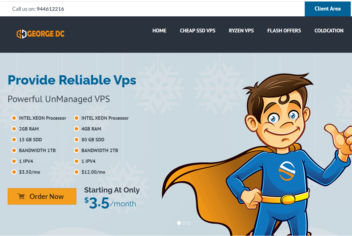
georgedatacenter39美元/月$20/年/洛杉矶独立服务器美国VPS/可选洛杉矶/芝加哥/纽约/达拉斯机房/
georgedatacenter这次其实是两个促销,一是促销一款特价洛杉矶E3-1220 V5独服,性价比其实最高;另外还促销三款特价vps,georgedatacenter是一家成立于2019年的美国VPS商家,主营美国洛杉矶、芝加哥、达拉斯、新泽西、西雅图机房的VPS、邮件服务器和托管独立服务器业务。georgedatacenter的VPS采用KVM和VMware虚拟化,可以选择windows...
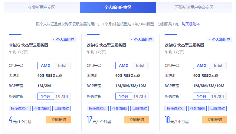
UCloud新人优惠中国香港/日本/美国云服务器低至4元
UCloud优刻得商家这几年应该已经被我们不少的个人站长用户认知,且确实在当下阿里云、腾讯云服务商不断的只促销服务于新用户活动,给我们很多老用户折扣的空间不多。于是,我们可以通过拓展选择其他同类服务商享受新人的福利,这里其中之一就选择UCloud商家。UCloud服务商2020年创业板上市的,实际上很早就有认识到,那时候价格高的离谱,谁让他们只服务有钱的企业用户呢。这里希望融入到我们大众消费者,你...
-
电脑管家和360哪个好360卫士和电脑管家,哪个更好电脑管家和360哪个好电脑管家和360卫士哪个好?免费阅读小说app哪个好有什么好用的看小说的app红茶和绿茶哪个好红茶和绿茶哪个比较好?云盘哪个好免费的网盘哪个好用啊?q空间登录QQ空间经常提示要登录?360云盘网页版最近360云盘网页版登陆后,找不到文件共享群了。哪位知道在哪里可以进去文件共享群?360云盘下载别人在百度知道给了你360云盘资源,怎么在360云盘使用????360云盘关闭360云盘,关闭了吗?360云盘36t360云盘怎么扩容到36T?_(:зゝ∠)_